
Gummy Aesthetic vs Frutiger Aero: How to Tell Two Kinds of Shine Apart
Both aesthetics run on shine, and people mix them up constantly. Here is the material test our studio uses to sort a jelly render from a glass one.

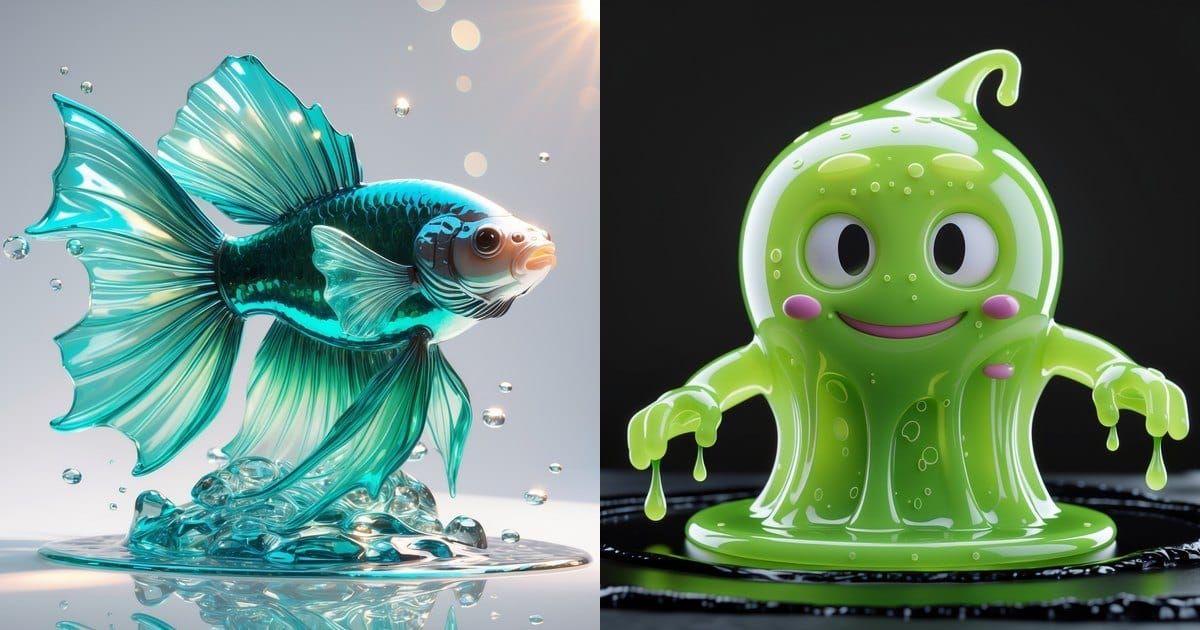
By Dave Dion-Labrecque · Updated August 2026 · 7 min read
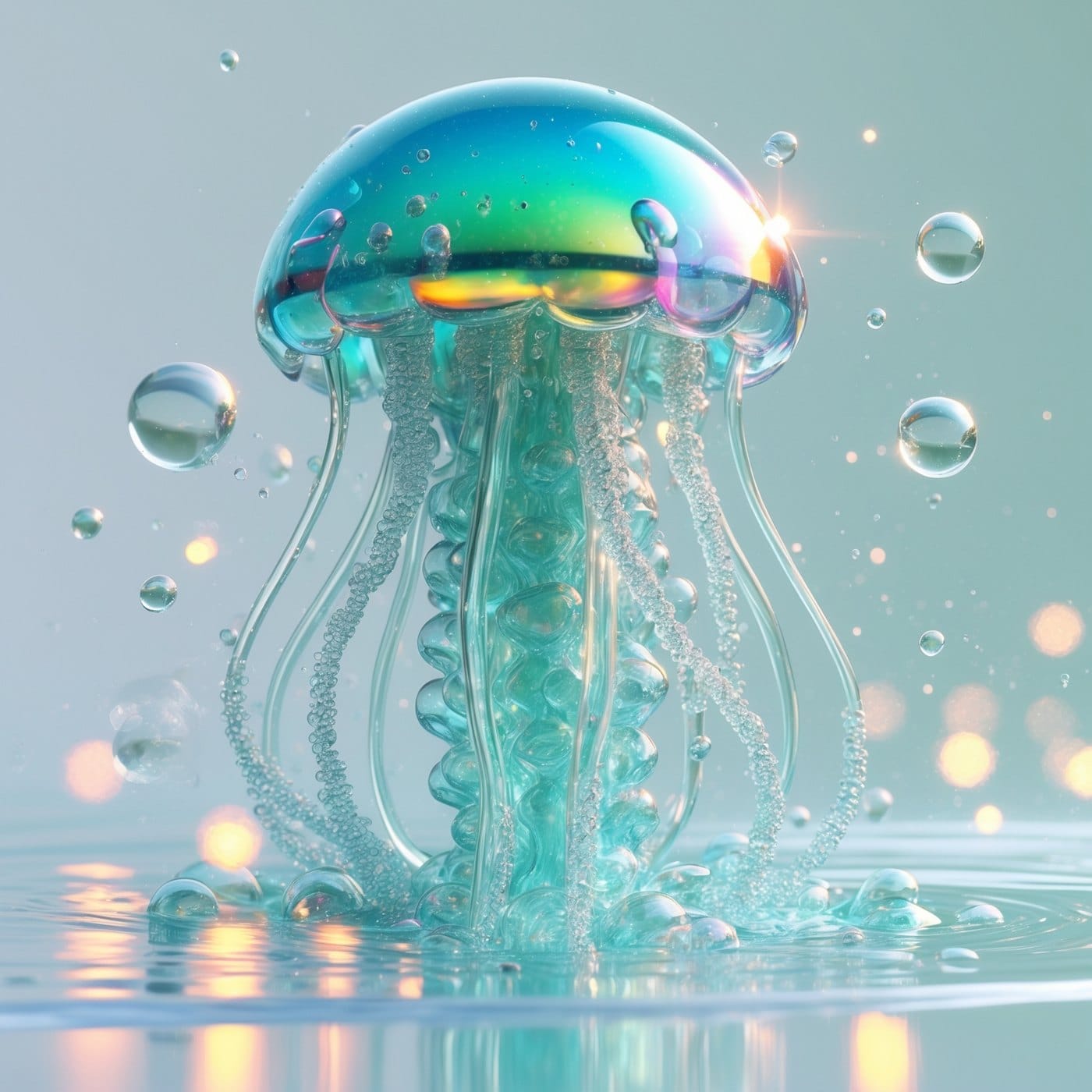
The disagreement started over a jellyfish. One of our designers had rendered a translucent bell with a faintly rainbowed dome, floating over still water with tiny bubbles suspended around it, and pinned it to the board we keep for candy-adjacent work. Someone walking past said it was on the wrong board. Within about four minutes, six people had opinions. Half the room read the image as gummy aesthetic. The other half read it as Frutiger Aero, and both halves were pointing at the exact same highlight to prove it.
That argument is worth having in public, because gummy aesthetic vs Frutiger Aero is one of the most common mix-ups on moodboards right now. Both traffic in gloss. Both love translucency. Both are nostalgic for something. And they are not remotely the same thing, which becomes obvious the moment you stop looking at the shine and start asking what the object is made of. This is the field guide I wish we'd had pinned to the wall before that jellyfish showed up.
Two glosses, two decades of dreaming
The cleanest first cut is chronological. Frutiger Aero looks back at a specific window of consumer technology, roughly 2004 to 2013, when operating systems and phone interfaces still wanted to look like physical objects. Glass panels, water droplets on a desktop wallpaper, aquarium screensavers, a battery icon with a highlight along its top edge. The name stitches together two references: Adrian Frutiger, the Swiss typographer whose humanist sans-serifs were bolted onto everything corporate in that era, and Windows Aero, the translucent interface Microsoft shipped with Vista in 2007. Nobody called it Frutiger Aero at the time. The label was assembled retroactively by online aesthetics archivists in the late 2010s, once enough people realised the look had died and started missing it.
The gummy aesthetic has a much shorter tail as a trend and a much longer one as an object. Pinterest formalised the current wave in its 2026 forecast of twenty-one emerging trends, filed under the name Gimme Gummy, and the underlying search behaviour backs it up: interest in gummy bear aesthetic climbed roughly fifty percent, and jelly blush more than doubled. The V&A's own read on what 2026 is wearing describes the same thing arriving in the physical world as chunky candy-coloured jewellery and phone cases built to be handled.
But the object itself is a century old, and that history is more interesting than the trend report. The gummy bear was invented in Bonn in 1922 by a confectioner named Hans Riegel, who called it the Tanzbär, the Dancing Bear, after the real bears that were still being paraded at European festivals. It was bigger than the modern version, tougher to chew, and made with gum arabic rather than gelatine. Smithsonian's account of how the Goldbear became a global object notes that Riegel's real innovation was not the recipe. Predecessors like the gumdrop and Turkish delight had already solved the chemistry. His innovation was giving the candy a face.
The material test: gummy is chewy, Frutiger Aero is wet
If you take nothing else from this, take this question. Look at the surface and ask whether it is wet or whether it is chewy.
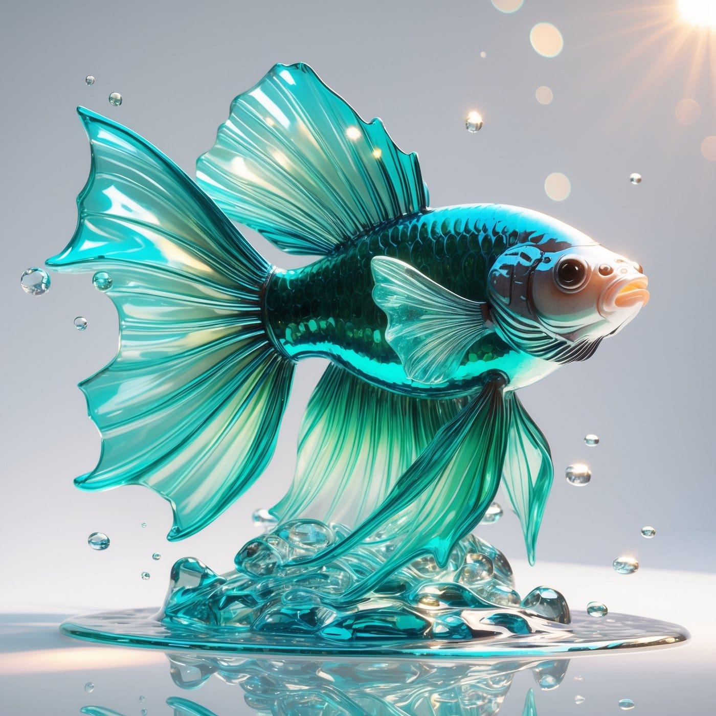
Frutiger Aero is wet. Its signature material is glass and water, which means the highlights are sharp, the reflections carry actual information about the environment, and light passes cleanly through the object and comes out the other side. Put a Frutiger Aero object in front of a window and you would see the window in it. There is usually a lens flare, because the fiction is that a camera is present.
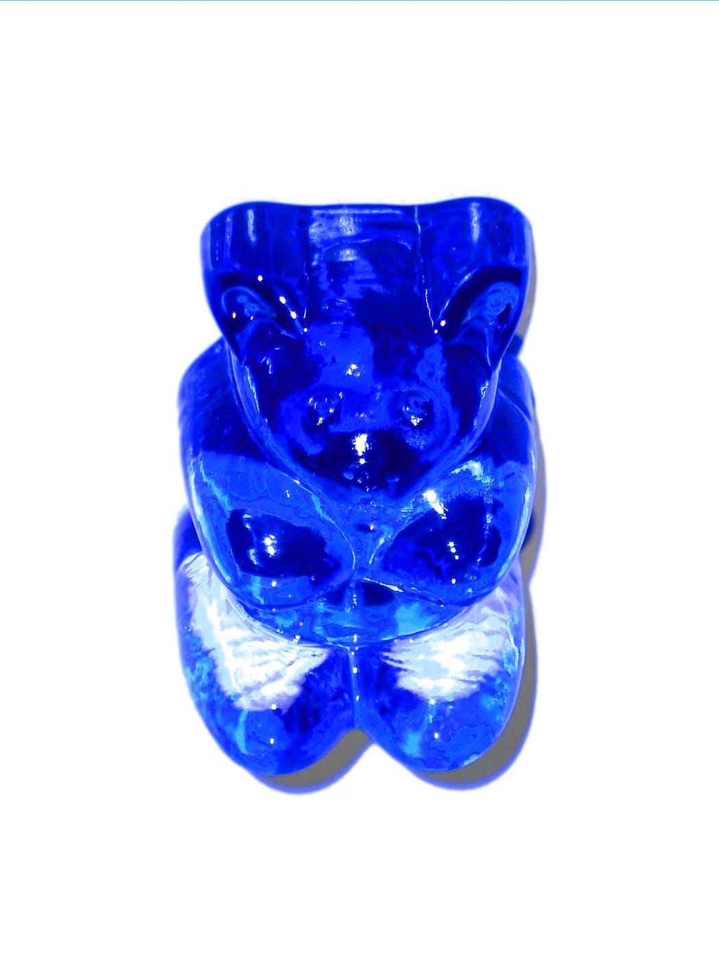
Gummy is chewy. Its signature material is resin, gelatine and soft plastic, which behave completely differently. Light does not pass straight through gummy material, it scatters inside it and comes back out looking milky and lit from within. The highlights are broad and soft rather than pinpoint. The edges are rounded because you can only mould gelatine so sharply. Most importantly, a gummy surface implies a squeeze. You look at it and your hand knows what it would feel like.
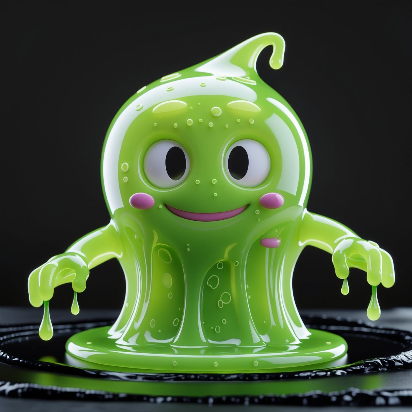
This is why the jellyfish confused everyone. It was rendered in glass, which made it Aero, but it was shaped like a blob, which read as gummy. Shape and material are separable, and material wins.
Colour will tell you almost everything else
The palettes barely overlap once you look for them. Frutiger Aero lives in aqua, sky blue, grass green and white, occasionally with a sunset orange for warmth. It is the colour scheme of a screensaver, which is to say the colour scheme of outdoors as imagined by someone indoors. The nature in it is always slightly too clean: a fern with perfect droplets, a hillside with no mud on it.

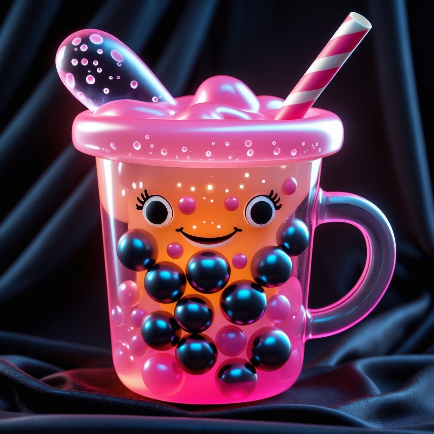
Gummy lives in confectionery brights: cherry red, lime, grape purple, orange, bubblegum pink. Crucially these colours are saturated but translucent, which is a difficult combination to find anywhere else. A gummy purple is not a flat purple. It is a purple you can see a little way into. Frutiger Aero has almost no red in it at all, which is a surprisingly fast way to sort an image: if there is cherry red and it is glowing, you are looking at gummy.

What each one is actually homesick for
Aesthetics stick when they are carrying an emotion that has nowhere else to go, and these two are carrying different ones.
Frutiger Aero is homesick for optimism about technology. That decade genuinely believed the digital world would be friendly, that it would look like nature, that your computer wanted to show you a tropical fish. The interfaces were skeuomorphic on purpose: buttons looked pressable, notepads had paper texture, and the whole visual argument was that the machine was continuous with the physical world you already trusted. If you want the formal version of that idea, the concept of the skeuomorph and its long history in design covers a lot of ground. Flat design killed that argument off around 2013, and Frutiger Aero nostalgia is, at bottom, grief for a version of the internet that seemed to like you. It shares that root system with the eco-optimism we wrote about in our piece on the solarpunk aesthetic and its green futures, and it is the sunlit cousin of the uneasier nostalgia running through dreamcore and liminal spaces.

Gummy is homesick for touch. Every account of this trend circles the same explanation, and I think it is correct: after fifteen years of glass rectangles and matte minimalism, people want objects that respond to being held. Chunky, squeezable, slightly resistant. It is the same impulse that drove the collectible boom we unpacked in our piece on how blind box toys became Gen Z's favourite object, and it explains why gummy shows up first in nails, lip gloss, jewellery and phone cases. Those are all things you touch constantly without thinking about it.
One is missing a feeling about the future. The other is missing a feeling in the hands.
Where the gummy aesthetic and Frutiger Aero genuinely overlap
Fair is fair. There is a real zone of confusion, and it has three residents.
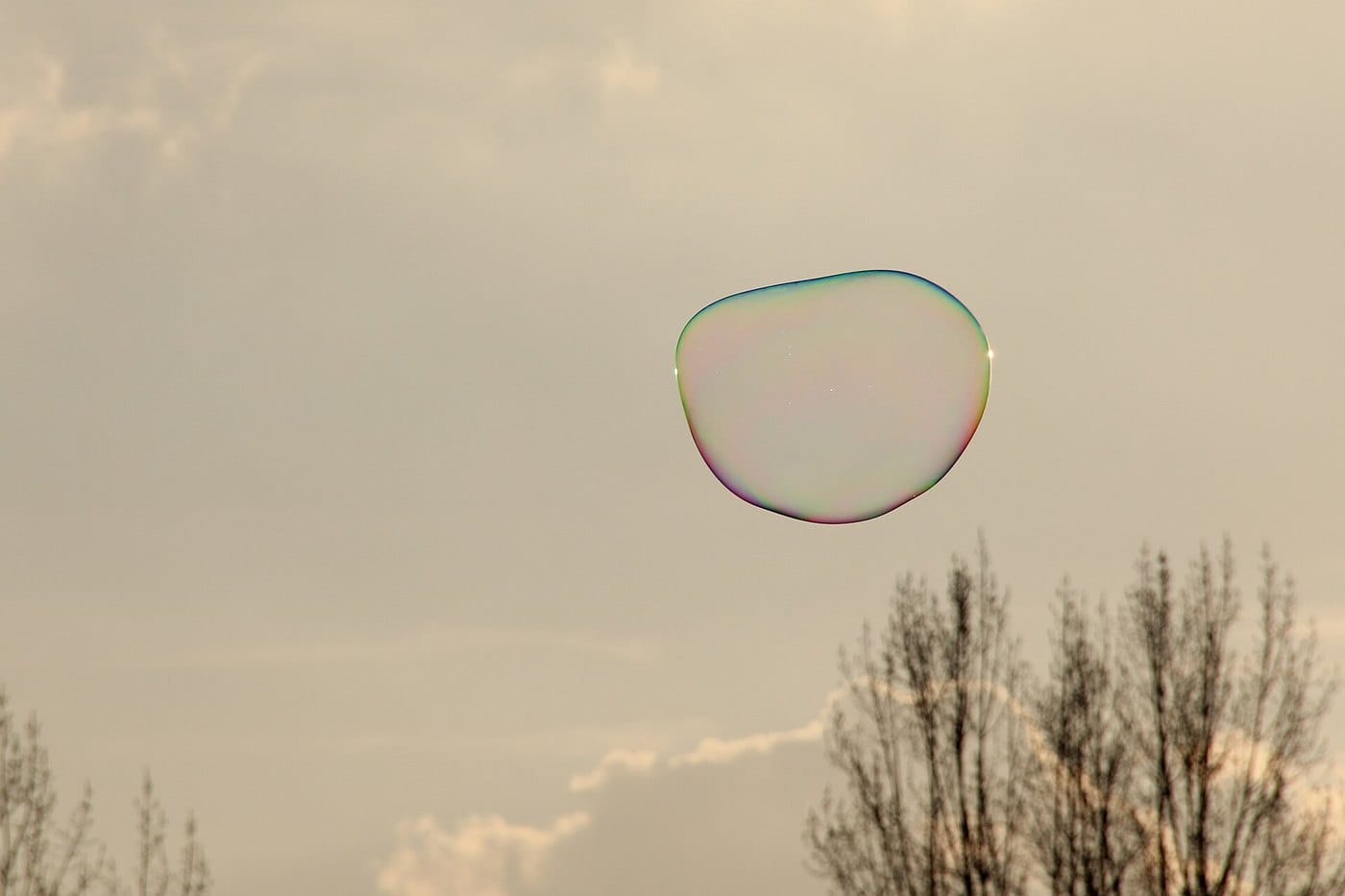
Bubbles. Both aesthetics use them constantly and neither has a claim. A bubble is translucent, glossy and rounded, which satisfies every surface condition on both lists.
Iridescence. Aero uses it as an optical event, the thin-film shimmer on a soap bubble or a dragonfly wing. Gummy uses it as a coating, a candy shell. Same rainbow, different logic. If the iridescence looks like physics, it leans Aero. If it looks like confectionery, it leans gummy. This is also the seam where both brush up against the opalescent surfaces we covered in the aliencore aesthetic.
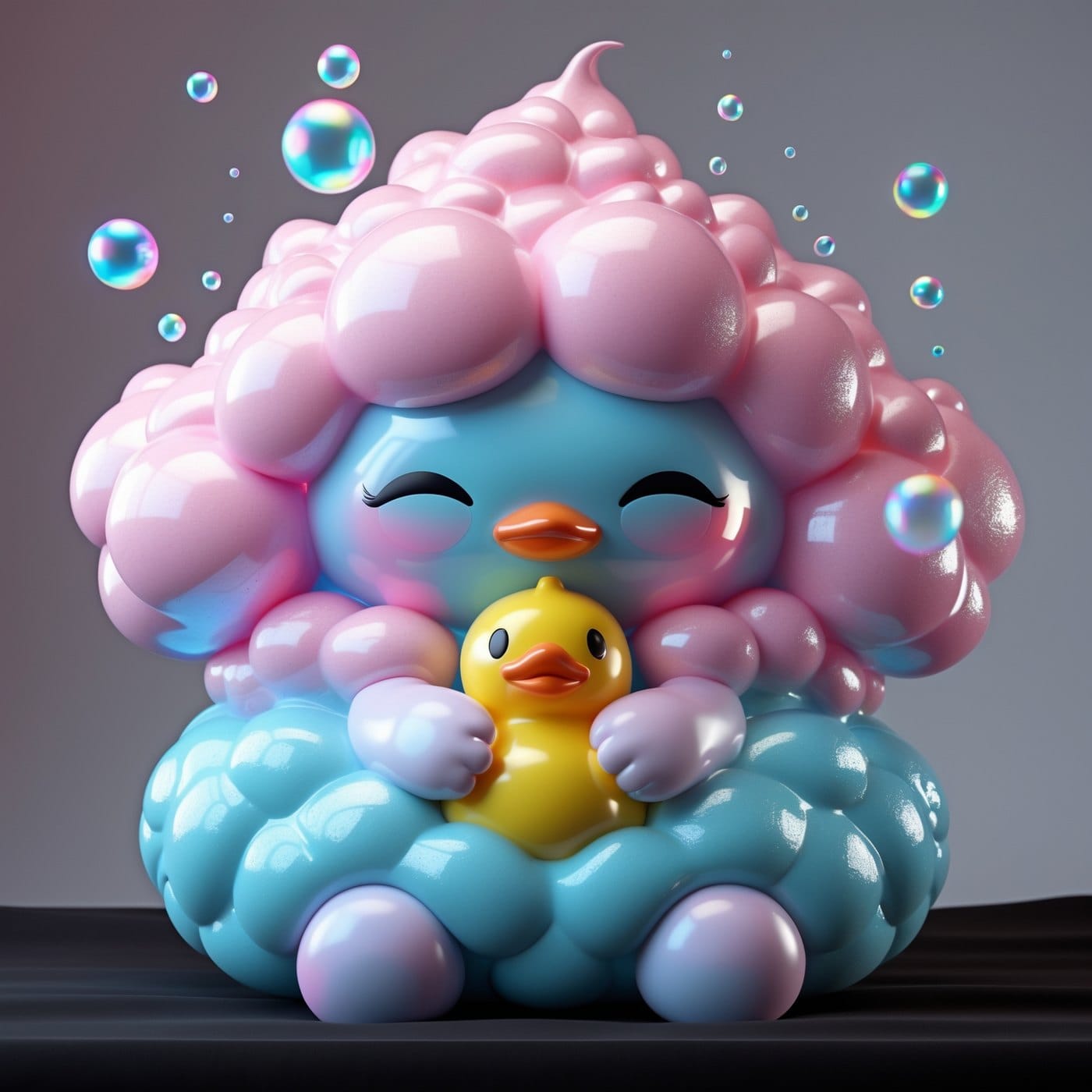
Blob shapes. Rounded, boneless, friendly forms belong to both. Aero got them from interface design, where round corners meant approachable. Gummy got them from casting and moulding, where round corners are simply what the process produces. The shape agrees. The reason for the shape does not.
The five-second field test
When we are sorting a moodboard quickly, this is the order we ask it in.
- Would it squeak or would it splash? Squeak means gummy. Splash means Aero.
- Is there cherry red? Almost certainly gummy.
- Can you see the environment reflected in the surface? That is glass, so Aero.
- Is the glow coming from inside the object or bouncing off it? Inside is gummy. Off it is Aero.
- Is there a lens flare? Aero is pretending to be a photograph. Gummy is pretending to be a toy on a table.
Four out of five in one direction and you can stop thinking about it. If you enjoy this kind of sorting, we ran the same exercise on two retro-futures in our guide to telling atompunk and dieselpunk apart, which have a similar habit of getting filed in the same drawer.
Why both are back at the same time
It is not a coincidence, and the explanation is duller than a conspiracy. Both aesthetics offer relief from flatness. The 2010s trained an entire visual culture on matte surfaces, thin type and grey interfaces, and the correction was always going to arrive as shine. What is interesting is that the correction arrived twice, along two separate routes. One route went back through the screen, to the last time software had texture. The other went back through the hand, to the last time an object was fun to hold.
If you are building a moodboard in 2026, you can borrow from both. Just know which one you are borrowing from at any given moment, because the two do not blend well. Glass next to gelatine reads as a mistake unless you commit hard to the collision. Pick the material first, then let the palette follow, and the board will hold together.
Frequently asked questions
Is the gummy aesthetic the same as Y2K?
No. Y2K runs on chrome, metallics and hard reflective surfaces, and its mood is futuristic. Gummy runs on soft translucent resin and its mood is childhood. They share a taste for shine and nothing else.
Is Frutiger Aero the same as vaporwave?
They come from overlapping years but opposite emotions. Frutiger Aero is sincere corporate optimism about technology. Vaporwave is ironic and melancholy about the same period. Aero wants you to believe the screensaver. Vaporwave wants you to notice it is a screensaver.
Which one is easier to wear?
Gummy, by a wide margin, because it translates directly into objects you can hold: jewellery, nails, bag charms, phone cases. Frutiger Aero is fundamentally a screen aesthetic, so wearing it usually means printed graphics rather than materials.
Can a single design be both?
Rarely, and only if the collision is deliberate. Glass and gelatine sitting next to each other without a reason reads as an accident to most viewers.
In our own studio this argument has practical consequences, since we spend most weeks deciding which material logic a graphic should follow before a single colour gets chosen. The glass-and-water side of it turned into our Holo Cryptids collection, where creatures are rendered as optical events rather than illustrations. The denser, more sculptural end went into Prismatic Beasts, which treats animals as cut and polished material. Neither is a gummy collection exactly, but both came out of the same question this article is about, which is what a surface is supposed to be made of before you decide what it looks like.
🎨 Original designs featured in this article are AI-generated and curated by The Design Drop. External photographs and illustrations are credited individually where used.
Love what you see?
Get free designs, exclusive deals & curated gift guides every week.
Subscribe to The Design Drop - it's free!