
The Aliencore Aesthetic: Why 2026 Wants to Look Like a Close Encounter


By Dave Dion-Labrecque · Updated July 2026 · 7 min read
The first time I understood that the aliencore aesthetic had stopped being a joke, I was reading a police report from 1955. A farm family in Kelly, Kentucky told officers they had spent the night shooting at small silver-grey beings with enormous luminous eyes and pointed ears, creatures that seemed to float rather than walk. Seventy years later, our studio was pulling colour references for a design brief and half the moodboard was pinned from that exact description: pearl skin, gold eyes, a body that catches light like a soap bubble. Nobody on the board had read the police report. They had just absorbed the look.
That gap is the whole story of aliencore in 2026. The visual language of the extraterrestrial has been circulating for so long, through so many hands, that it has detached from belief entirely and become a finish. A texture. Something you can buy in a lip gloss.
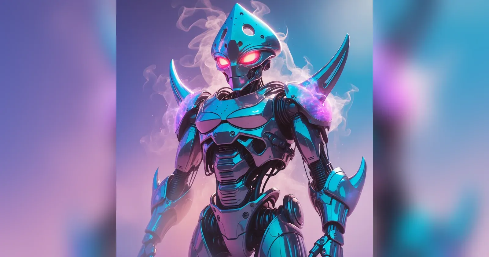
What the aliencore aesthetic actually looks like
Pinterest called it "Extra Celestial" in its 2026 forecast, and the search data behind that label is unusually specific. Interest in "alien core aesthetic" climbed 80 percent year over year, "alien inspired makeup" 140 percent, and "opalescent" 115 percent. WWD's breakdown of the forecast grouped it with cosmic silhouettes and holographic home accents, which is the tell: this is not a costume trend, it is a surface treatment applied across categories.
In practice the vocabulary is narrow and consistent. Skin reads wet rather than matte. Fabrics shift colour when you move, usually toward violet, mint, and a cold silver-pink. Silhouettes are either elongated and boneless or sharply architectural, with very little in between. Eyes get emphasized past the point of realism. And crucially, the palette is cool: aliencore almost never goes warm, which is what separates it from Y2K chrome and from the gold-heavy space imagery of the 1970s.
The Pinterest team claims roughly 88 percent accuracy on these forecasts over six years, which I take with a grain of salt. Still, the direction matches what we have watched happen in our own studio: iridescent and structurally-coloured finishes have been the single most requested surface treatment in our briefs since spring, well ahead of anything we predicted in January.
Opalescence is doing most of the work
Strip aliencore down and what is left is one optical effect: light splitting into colour as it passes through a structure rather than bouncing off a pigment. That is not a metaphor. Precious opal produces its play-of-colour because it is built from microscopic silica spheres packed in a lattice, and that lattice diffracts light into visible bands. The colour is not in the stone. It is in the geometry.
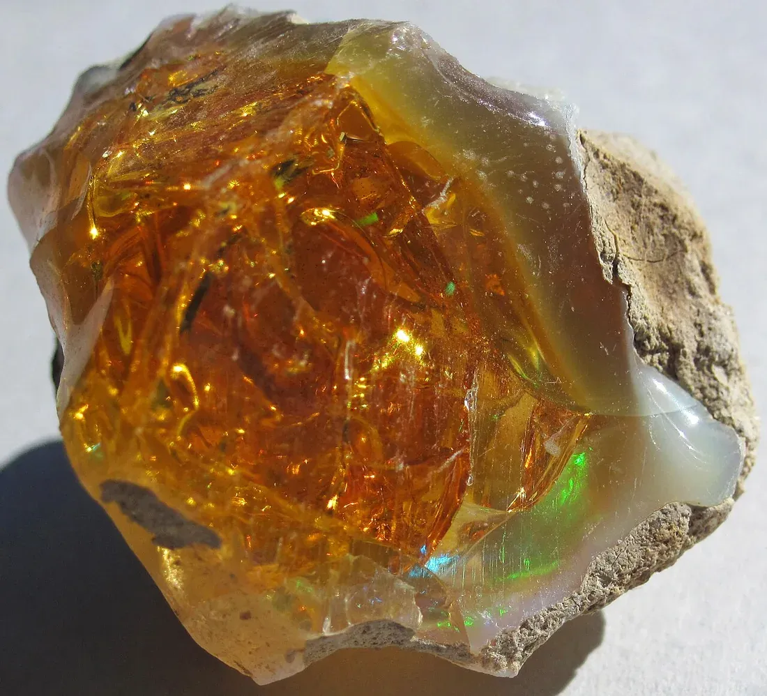
Human eyes seem to read this as a signal of the non-terrestrial, which is odd given that opal, beetle shells, oil slicks, and butterfly wings are all extremely terrestrial. We wrote about that instinct at length in our piece on why gemstones carry meaning across cultures, and it shows up again in the deep-sea and bioluminescent aesthetics that keep resurfacing in fashion. Structural colour looks manufactured because it behaves unlike paint, and anything that behaves unlike paint gets filed under "elsewhere."
Designers exploit this shamelessly, and I include us in that. When we render a creature in an opalescent finish, we are not adding realism. We are adding an alibi for strangeness.
The alien has a design history, and it is shorter than you think
Here is the part that surprises people: the grey alien is younger than the electric guitar. Modern flying saucer culture starts in the summer of 1947, when the Roswell Daily Record ran a front page announcing that the Army Air Forces had captured a flying disc on a New Mexico ranch. The object turned out to be a high-altitude balloon. The headline outlived the correction by about eighty years.

The body came later, and it came from witnesses rather than artists. The Flatwoods sighting in West Virginia in September 1952 produced a seven-foot figure with a spade-shaped head and red eyes under a cowl. The Kelly-Hopkinsville encounter of August 1955 gave us the small silver-grey being with oversized ears and yellow eyes, and a local newspaper's phrasing helped seed the phrase "little green men" into the language, as HISTORY has traced in detail. Massachusetts contributed the Dover Demon in 1977, all head and no face.
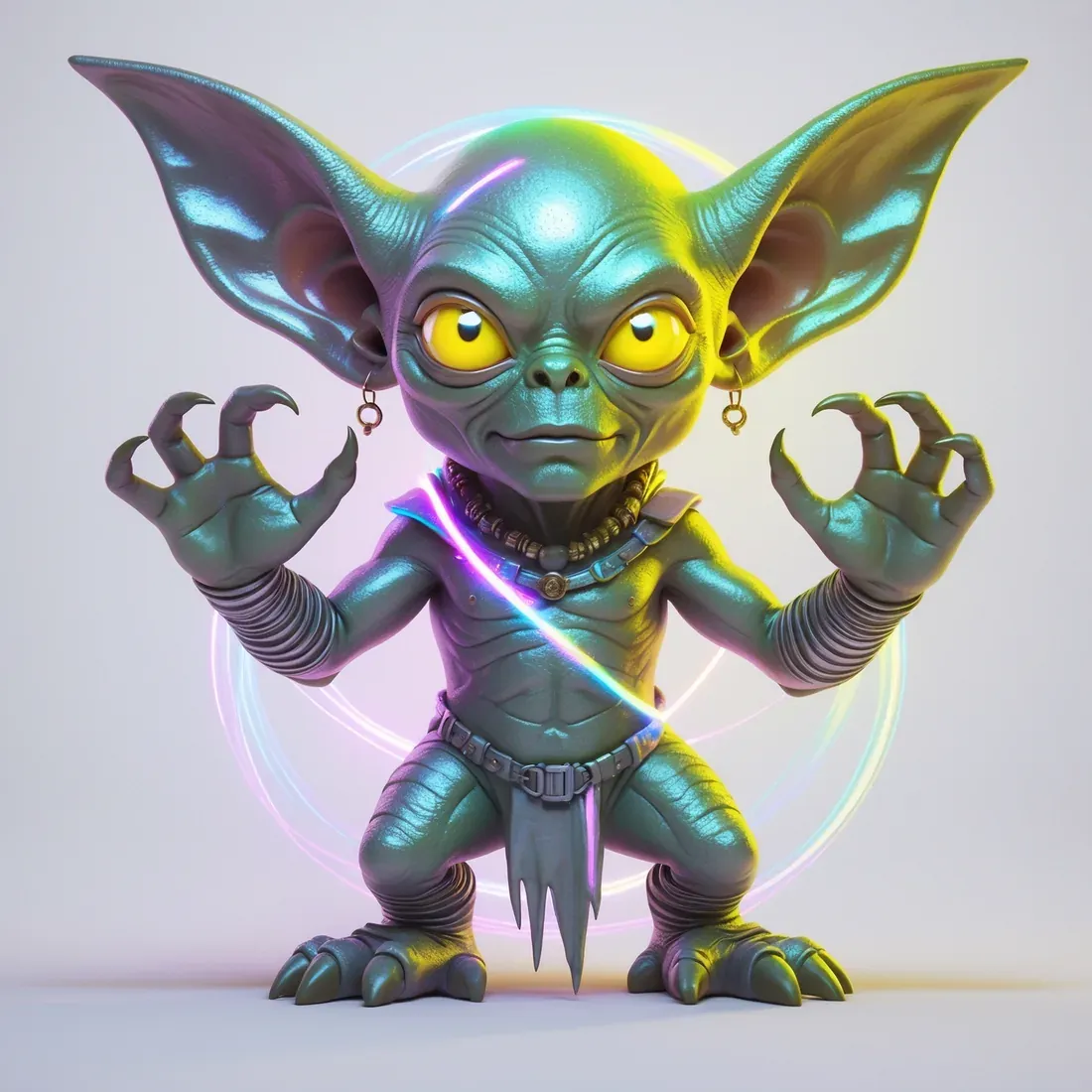
None of these descriptions matched each other particularly well. What standardized the face was publishing. Ted Seth Jacobs painted the cover of Whitley Strieber's Communion in 1987, working directly from the author's description, and that single image did more to fix the canonical grey than every witness account combined. The Smithsonian has written about why we default to the extraterrestrial explanation for anything unidentified, and the short version is that we had a picture ready before we had a phenomenon.

So when a 2026 mood board reaches for "alien," it is reaching for a small set of images produced by a handful of Americans between 1947 and 1987. That is a folklore, not a biology.
Space Age fashion got there first, and it was optimistic
Fashion has done the cosmos before, and the last full cycle is worth remembering because its mood was the opposite of ours. In the mid-1960s, with the space race at full volume, Paris responded fast. Andre Courreges showed his Moon Girl collection in 1964 and put women in white PVC and flat go-go boots. Pierre Cardin built the Cosmocorps line around hard modernist geometry. Paco Rabanne assembled dresses from metal discs and chain, closer to armour than clothing.
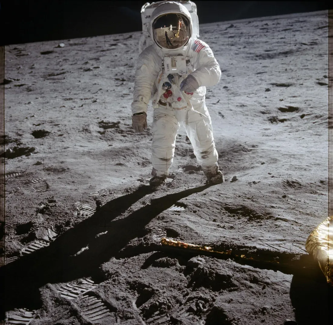
Courreges was invited to Cape Canaveral by NASA, which tells you how much this was a two-way conversation. Highsnobiety's history of Space Age design makes the point that those collections were fundamentally hopeful: they dressed people for a future everyone assumed was arriving on schedule. We covered the same optimism-versus-anxiety split in our comparison of atompunk and dieselpunk, and it applies here too.
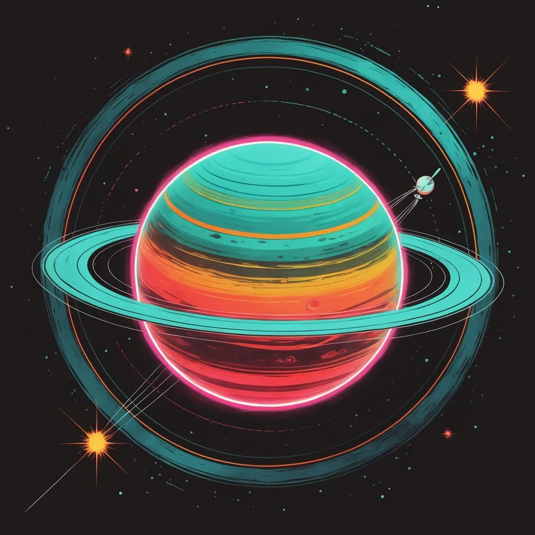
Aliencore inverts that. The 1960s dressed you as the astronaut going out. 2026 dresses you as the thing arriving. That flip is the most interesting thing about the trend, and I do not think it is accidental.
Why now
Three things seem to be feeding it at once.
The first is exhaustion with legible identity. 2026's other big story is the so-called "no aesthetic" aesthetic, a refusal to be sorted into cottagecore or light academia or any other tidy box. Aliencore is a strange sibling to that impulse: instead of refusing a category, it picks a category that is definitionally outside every human one. You cannot be misread as trying to belong to a subculture if you are dressed as a non-participant.
The second is that the subject stopped being embarrassing. Congressional hearings on unidentified anomalous phenomena moved the topic from tabloid to C-SPAN, and once something is discussed in a committee room it becomes available as a reference without irony.
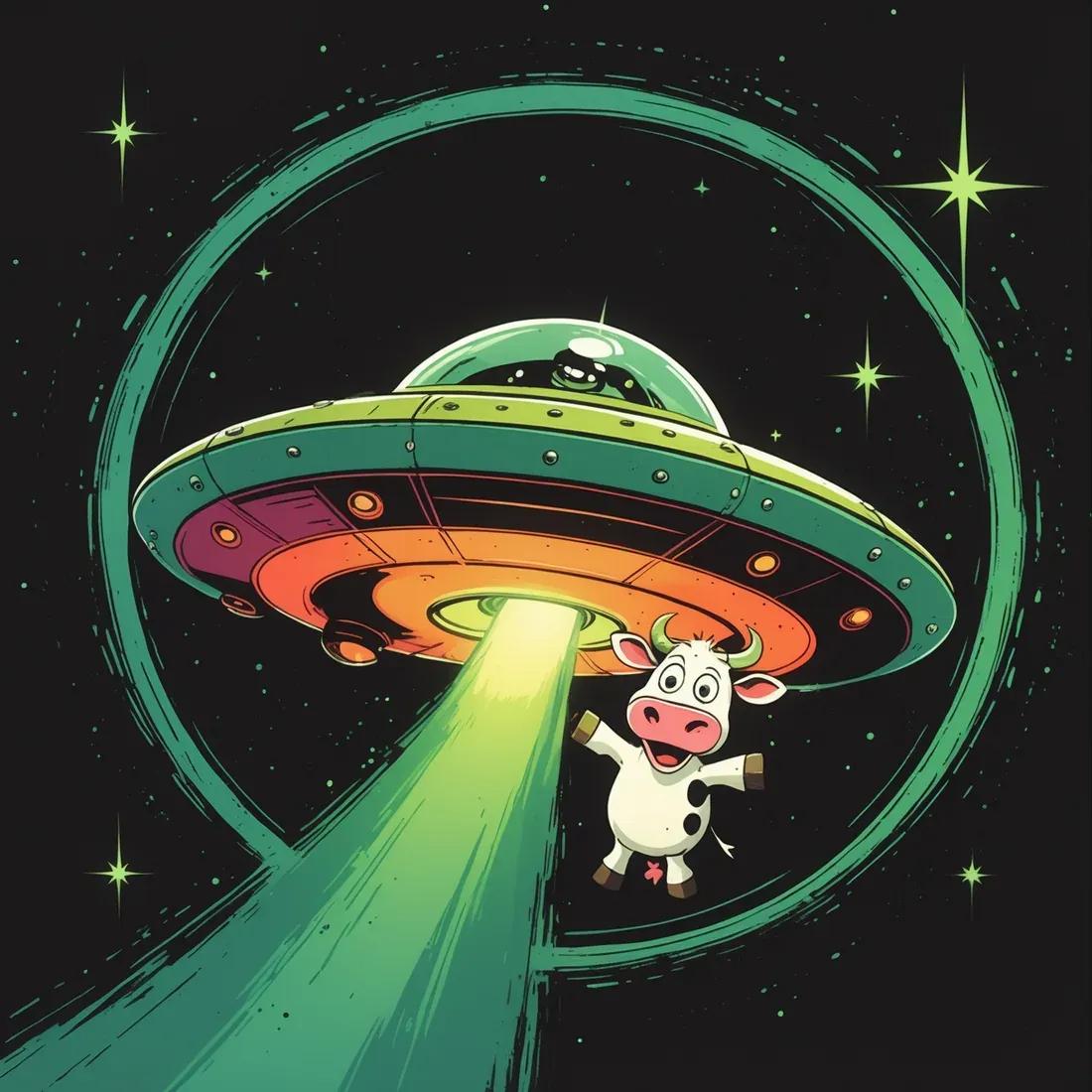
The third is the uncanny valley we now live in full time. We spend our days looking at images that are almost right, generated faces with slightly wrong eyes, video that moves a half-beat off. Aliencore takes that low-grade unease and makes it deliberate. If everything already looks a little synthetic, you may as well choose the version of synthetic that flatters you. Our piece on solarpunk and eco-futurism argued that aesthetics are how people rehearse futures they cannot yet articulate, and aliencore is the same mechanism pointed at a stranger horizon.
Wearing it without looking like a costume
The failure mode is obvious and I have watched people walk straight into it: full holographic head to toe reads as a rave outfit or a Halloween store. The version that works treats iridescence as an accent against something matte and structured. One shifting surface, everything else flat.

Colour discipline matters more than material. Stay cool: violet, mint, cold silver, that specific bruised pink. Introducing gold or copper pulls the whole thing back toward 1970s disco, which is a fine look but a different one. And keep exactly one alien signifier per outfit. A single oversized-eye motif is unsettling. Three of them is a theme party.
FAQ
Is aliencore the same as Y2K futurism?
They share chrome and holographic finishes, but the temperature and the intent differ. Y2K futurism is warm, glossy, and consumer-optimistic, built around gadgets and pop stars. Aliencore is cool, matte-and-wet in contrast, and organic rather than technological. Y2K wants to look expensive; aliencore wants to look unplaceable.
Where did the grey alien face come from?
Witness accounts from the 1950s onward described broadly similar beings, but the standardized image dates to the 1987 cover of Whitley Strieber's Communion, painted by Ted Seth Jacobs to the author's description. That painting became the reference point for nearly every grey alien depicted since.
What colours define the aliencore aesthetic?
Cold opalescent tones: violet, mint green, silver, pale blue, and a pink that leans grey rather than warm. Play-of-colour effects that shift with viewing angle are more important than any single hue.
If this aesthetic lands for you, our Holo Cryptids collection came out of exactly this research. It takes documented encounter cases (Flatwoods 1952, Kelly-Hopkinsville 1955, Dover 1977, and a dozen more) and renders each one in the opalescent, structurally-coloured finish this article has been circling. We built it because the folklore descriptions and the 2026 colour story turned out to be describing the same thing seventy years apart.
The designs in this piece are drawn from that collection and from Astro Pulp, our mid-century science fiction series, which handles the warmer and funnier end of the same subject.
🎨 Original designs featured in this article are AI-generated and curated by The Design Drop. External photographs and illustrations are credited individually where used.
Love what you see?
Get free designs, exclusive deals & curated gift guides every week.
Subscribe to The Design Drop - it's free!